
Featured Post

Using artificial intelligence in conceptual design
We're seeing AI-driven products becoming an integral part of our daily lives. In this post we look into some of the tools on offer and explore what they can do.
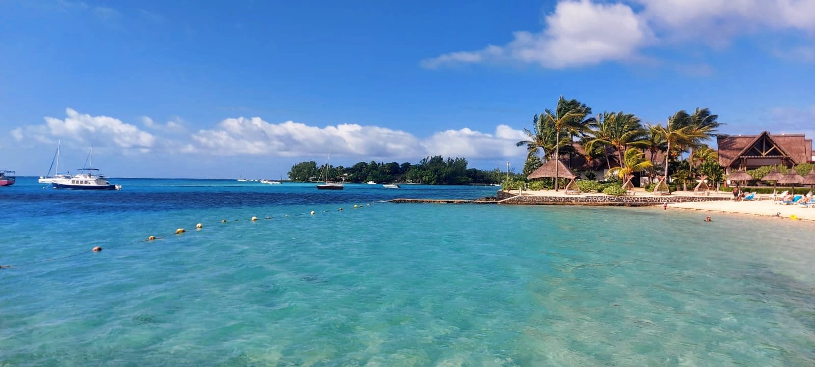
Mauritius Island
Walking through the busy markets and engaging with locals allowed me to witness first hand the intricate patterns and colour combinations of Mauritius.

The Dash
This brand represents a group of writers and editors. With that in mind, the logo has been designed in glossy black to mimic the look of ink from a fountain pen. The handwritten font looks as if the ink is still wet from just being written. This is to signify the fresh-minded approach which they apply to their work. Working on this brand was a nice opportunity to play with text while being limited to black and white.

Dockside Exchange
The brand being highlighted today uses metal as a colour theme, since the main product being sold shipping containers. The logo shape shows the twisting of an abstract shipping container to show how the product can be used for various uses, and also links to the “exchange” from one harbour to the next.
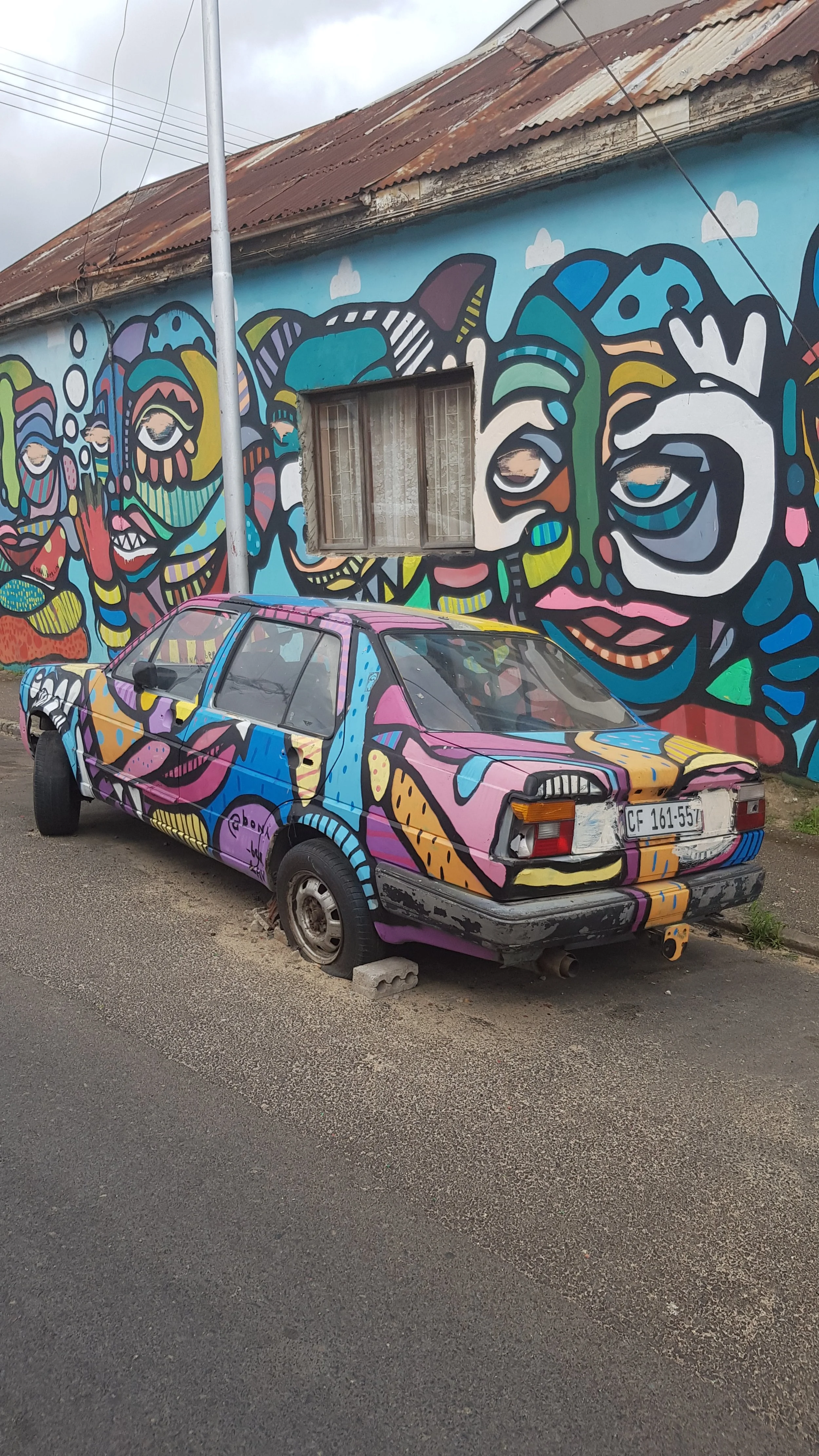
Inspired by the world
When I write my blog posts, I see them as a pin board of ideas that inspire me from around the world, and the result they have in my finished projects. In this post, I connect the art that resonated with me from across the world, and which continue to inspire my work.

Logo: PREFABulous Solutions
On 18 July, for the second year running, the CWDI and their sponsors arranged a Mandela Day event to help small scale entrepreneurs and non-profit organisations.
Having a well-crafted personal brand can attract more opportunities, establish credibility while placing you as an authority in your industry. Take charge and shape your own career path. In this article, we will explore the steps to update your personal brand to create a powerful online presence that aligns with your dreams and values.